VicRoads

Introduction
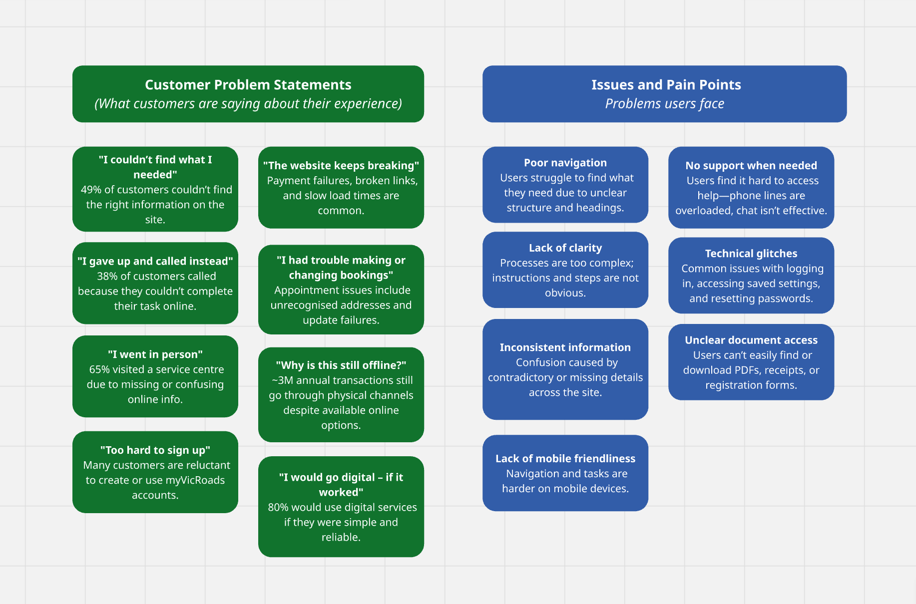
The VicRoads site was outdated, yet millions relied on core services such as registration and licensing. Many abandoned tasks and turned to call centres instead.
The brief: make high-volume services faster to complete, apply the refreshed VicRoads brand, and help cut call centre demand by the equivalent of 20 Full Time Employees.
Within four months of design, followed by two months of build support, I led redesigned navigation, new templates, and a brand-aligned design system for Adobe AEM’s modular framework.
The result was a modern, mobile-friendly site with clear pathways, consistent patterns, and a scalable system balancing user needs with business goals.
Team
Role:
Research, UX, UI, Visual design
Team:
2 Designers
Time:
6 months
Customers still relied heavily on phone and in-person support for simple tasks like renewing rego or updating details.
The old site’s structure didn’t match how people thought, content was too wordy, search was unreliable, and mobile usability and accessibility were inconsistent.
Its dated visual design also failed to reflect the new VicRoads brand.
The redesign needed to make top services easy to find and complete, guide users without dead ends, give content authors reusable templates, apply the new brand, and help reduce call centre demand by 20 FTEs.
Quote

I could never find what I needed. It was easier just to call.
VicRoads customer
Call logs, analytics, customer interviews and accessibility audits were reviewed to understand how people used the site.
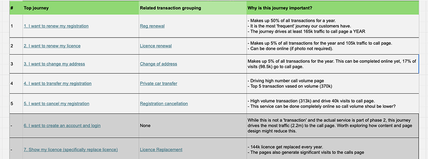
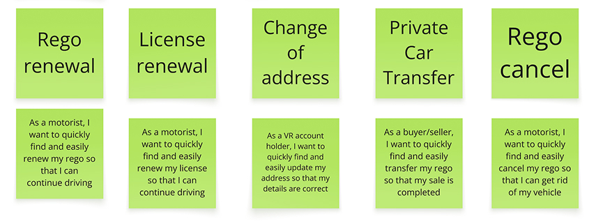
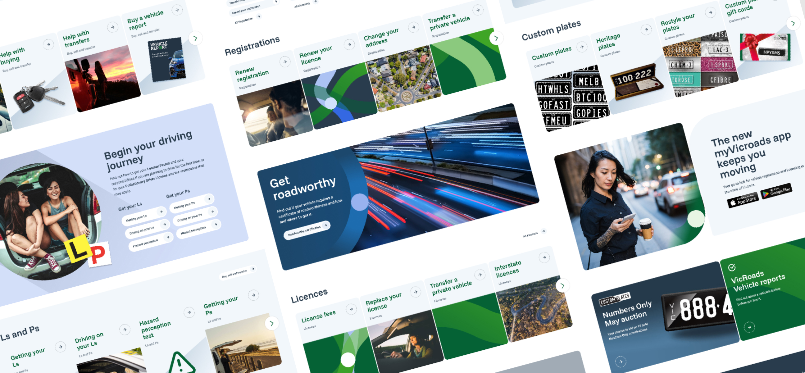
Most visits focused on five key tasks: renewing registration or licence, changing address, transferring or cancelling rego.
Many users abandoned tasks due to unclear labels, looping journeys and dense content. Mobile users in particular struggled with navigation. People wanted clarity, reassurance and plain English.
Reducing friction in these tasks was essential.
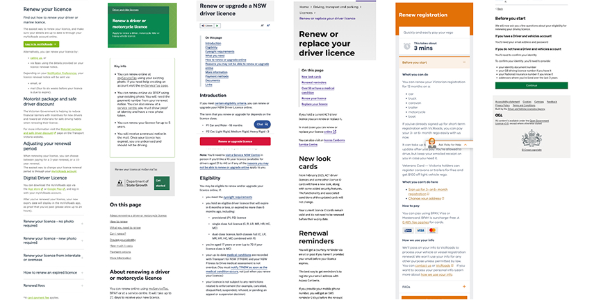
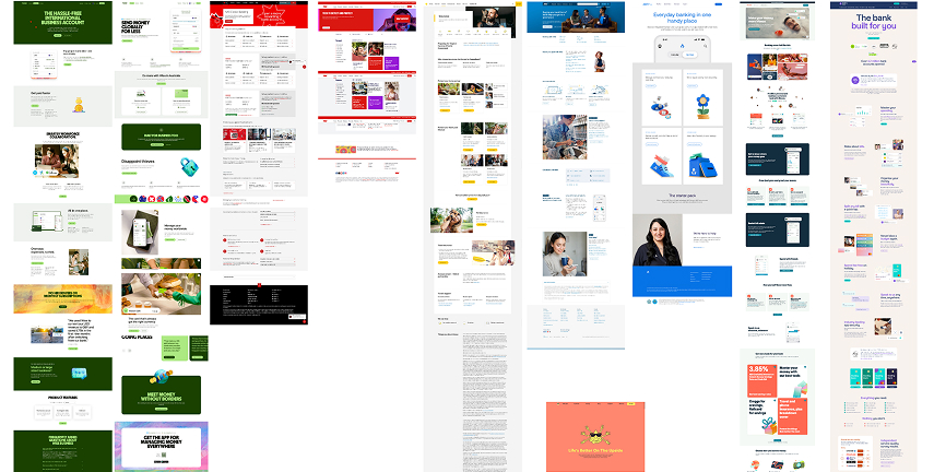
We benchmarked against digital services, including Service NSW, GOV.UK, and leading banks.
Successful sites placed common actions front and centre, used clear card-based navigation, and modular components for scalability.
These examples informed our homepage hierarchy, card structure, and design system.
They also helped define accessibility and mobile standards, ensuring VicRoads’ new platform could evolve with future services and customer expectations.
Research insights were reframed into intent-based groupings — shifting from internal categories like Licensing or Vehicle Registration to customer-led statements such as “I want to renew…” or “I want to cancel…”.
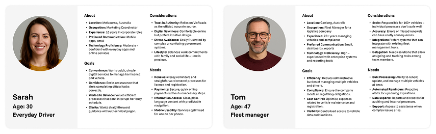
Lightweight personas, based on usage data and support call trends, kept design decisions grounded in real behaviours.
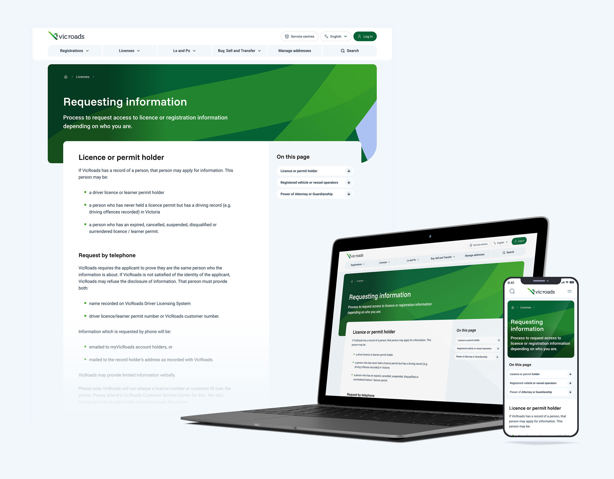
Common pathways for top transactions were mapped to guide template needs, distinguishing between content-heavy information pages and task-focused service pages.
This thinking shaped the content model, homepage hierarchy, and navigation, forming the foundation for all page templates, all aimed at shortening task time and reducing support demand.
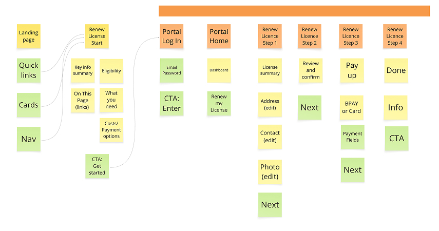
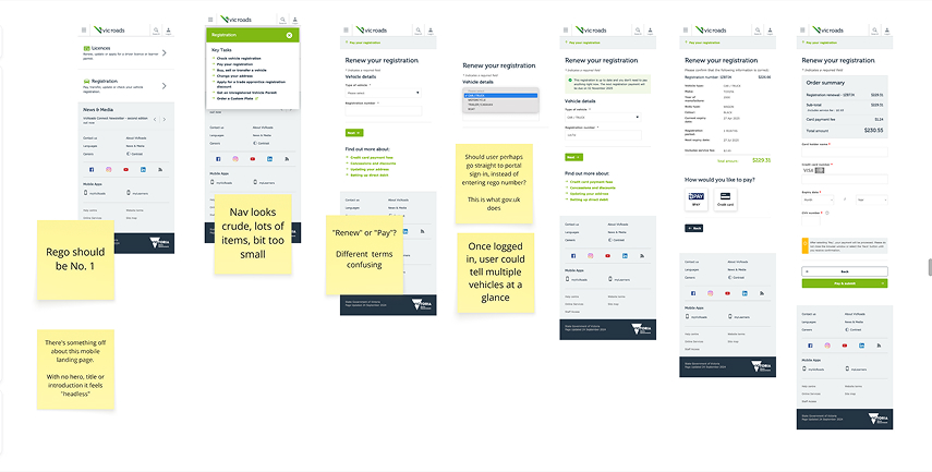
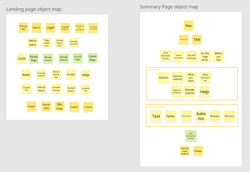
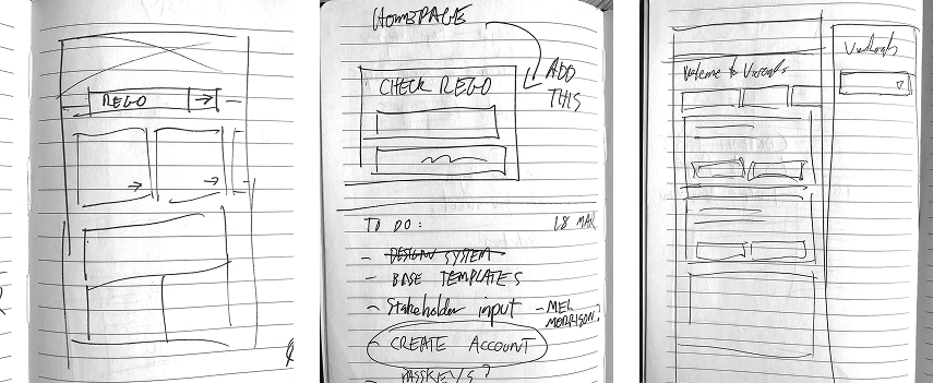
With clear goals, I began ideation using object mapping, sketches, and wireframes:
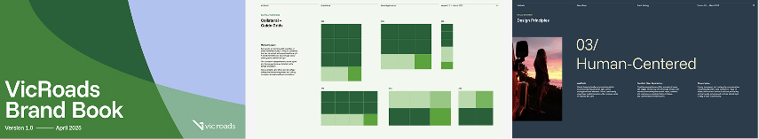
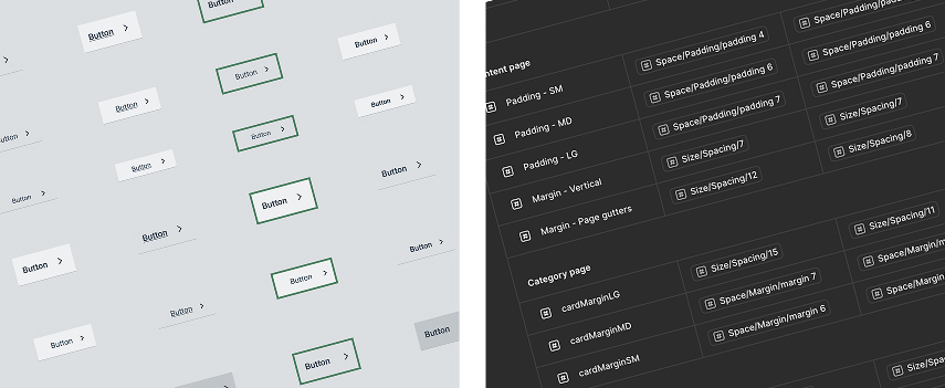
I also set up a Figma design system aligned with the new brand.
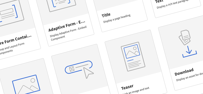
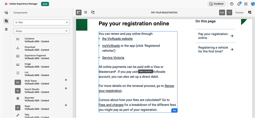
Since the site would be built in AEM using out-of-the-box components. Everything had to work within a modular drag-and-drop framework, so authors could build pages without developer support.
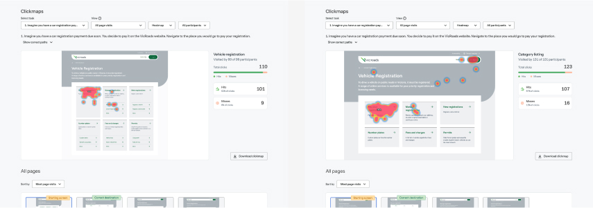
Key pages and UI elements were tested. Users were asked to find specific content pages (e.g. cancel a boat licence) on levels two and four.
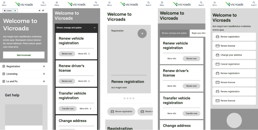
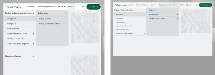
Two card designs were tested for category listing pages. One direction was single link cards, the other with multiple links per card.
Single-link cards. Success rate:
Multi-link cards. Success rate:
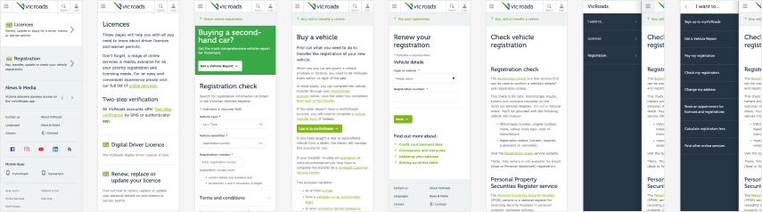
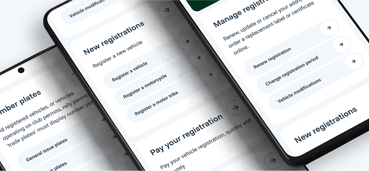
On mobile, two versions were created: one with single level and a horizontal motion, the second employing accordions.
Side-to-side navigation between IA levels. Success rate:
Accordion style. Success rate:
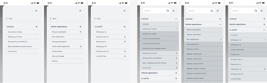
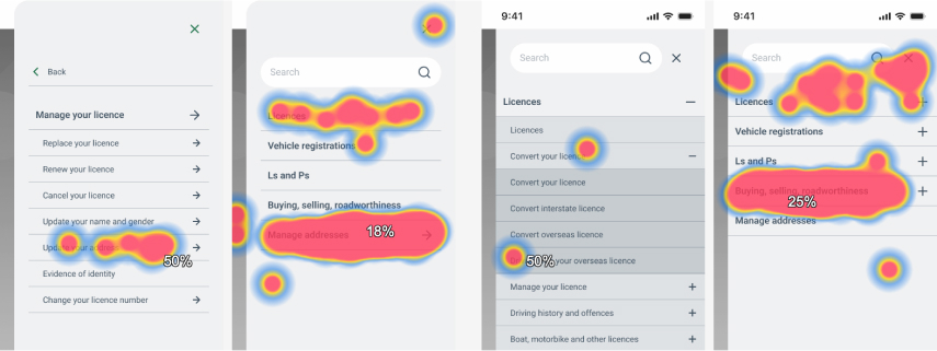
Testing the negative impact of hiding nav items with a “More” button
Nav items nested inside a “more” tab. Success rate:
All nav items exposed. Success rate:
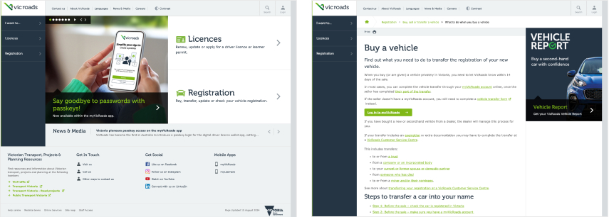
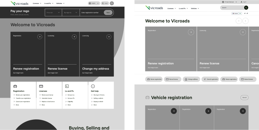
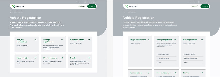
Clear entry points for top tasks, space for business-driven content, clear navigation, and a flexible modular layout.
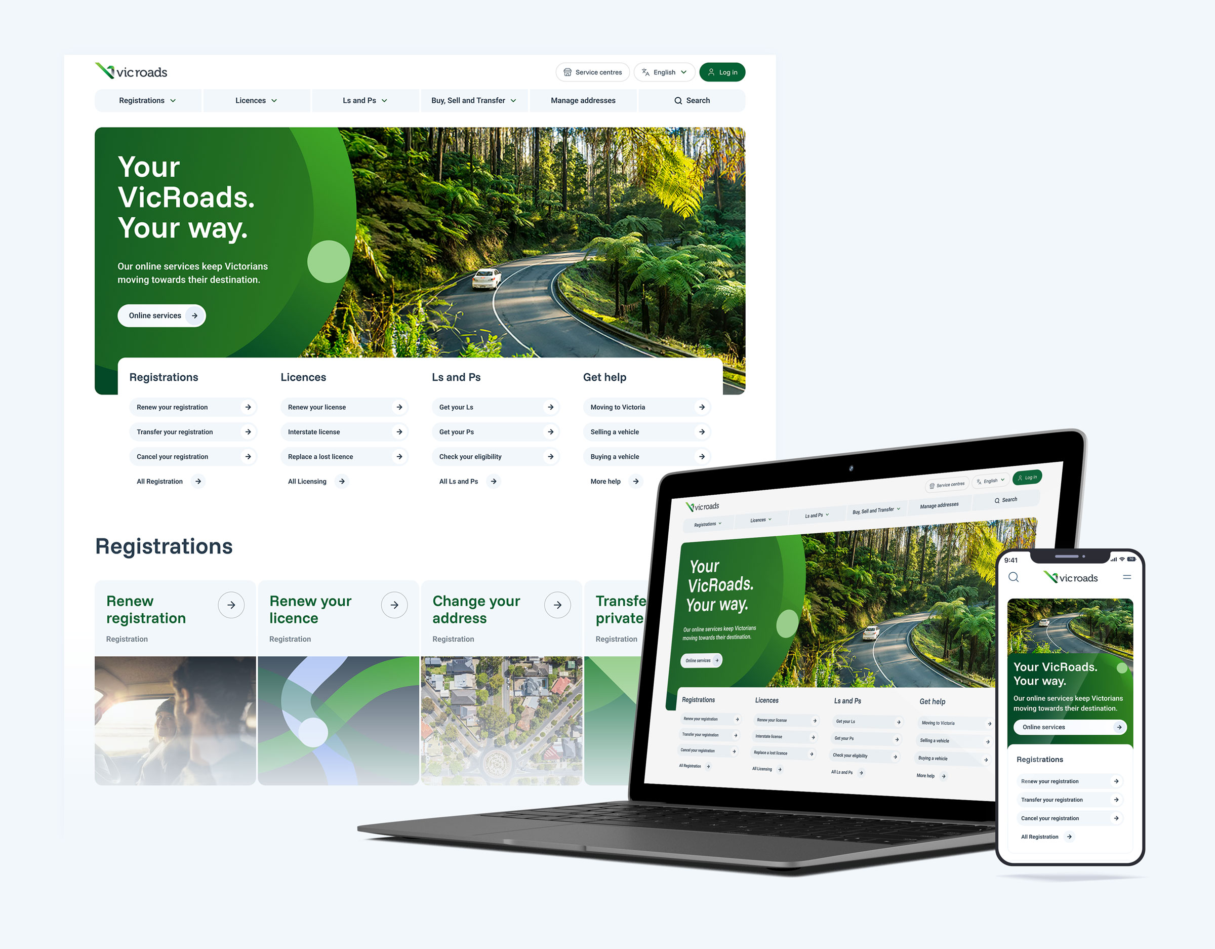
Interpreting the brand into UI elements.

Multi-link cards exposing deeper popular links, consistent labelling, and IA groupings to reduce backtracking.
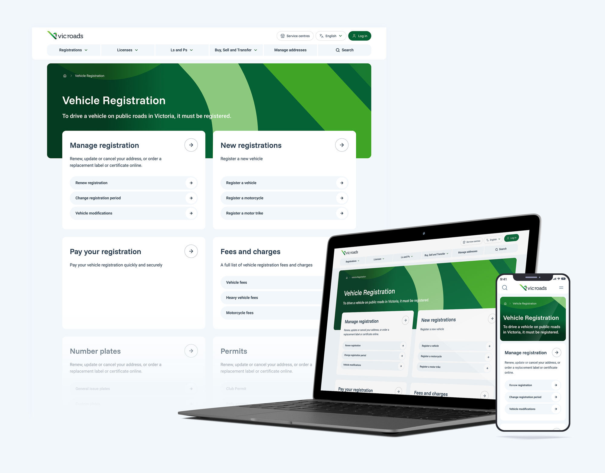
Scalable patterns for both service and information pages, with every component designed for AEM’s drag-and-drop authoring.
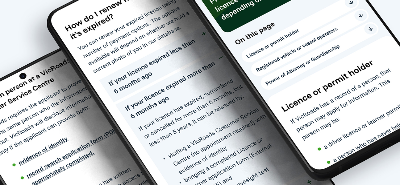
Much improved IA and navigation, using an accordion style on mobile.
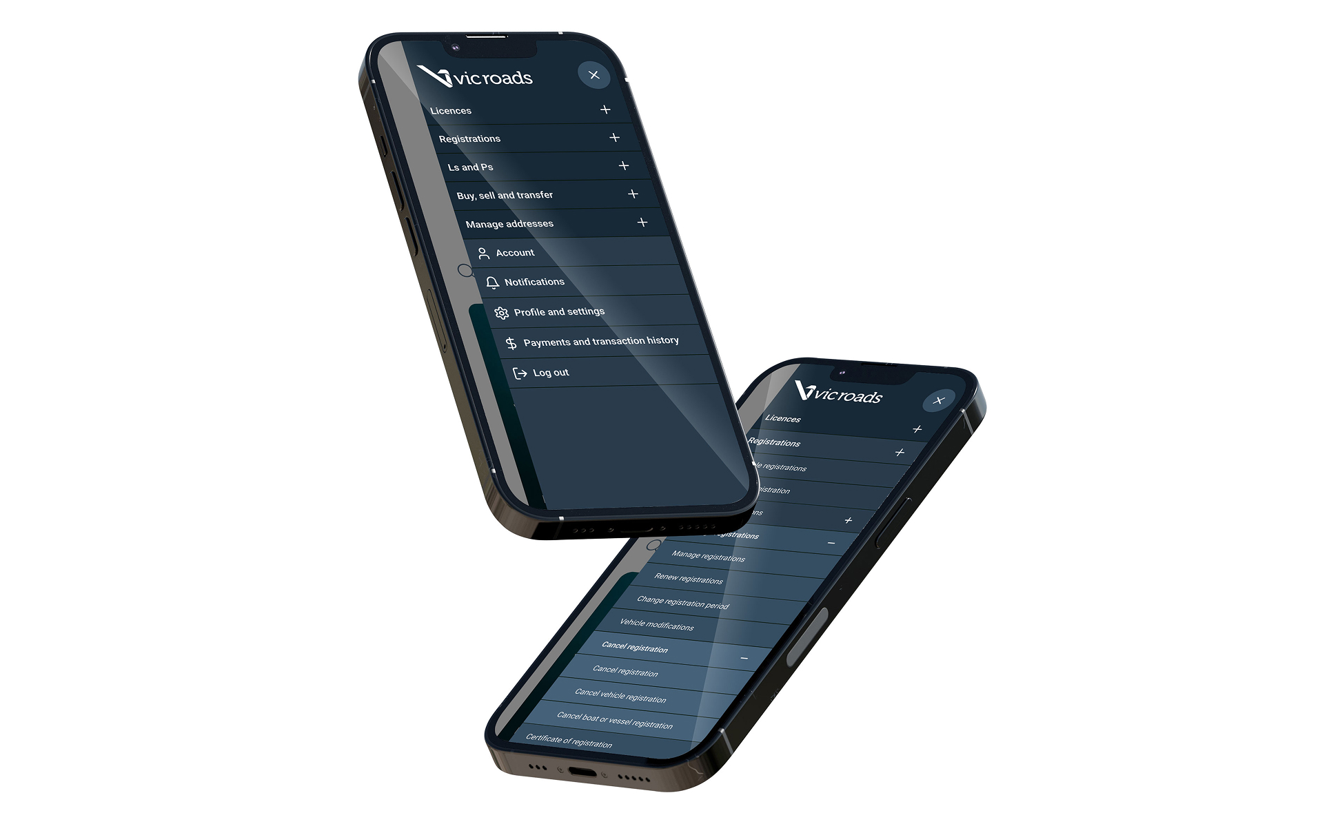
Finalised templates were all built from the new AEM-ready design system.
Outcome
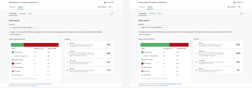
The new site launched on time and created a scalable, user-centred foundation for future digital services. Early results:
The redesign is projected to cut call volumes significantly - potentially saving the equivalent of 20 full-time staff - while improving the experience for millions of Victorians.

