Latrobe Health Services

Finding cover and driving sales for health insurance

Multiple tilted smartphones display health insurance forms for Medicare details, previous health cover, Lifetime Health Cover loading, and personal details on a blue background.

Introduction

Latrobe Health Services were seeing dramatic drop-offs in their sales funnel.

A strategy team and I were tasked with identifying problems and improving conversions.

I undertook an UX audit and competitor analysis, then led the client through weekly design sessions in pursuit of a solution.

I delivered a design in six weeks, and the new sales funnel is now undergoing development.

Team

Role:
UX, UI, Visual design

Team:
1
Designer, 1 x Product Manager

Time:
6 weeks

Problem

Latrobe Health Services were seeing dramatic drop-offs at the start of their sales funnel.

The existing design was outdated and in need of a review. It was hoped that a redesign would increase conversions.

Research

Key stakeholders in the marketing and sales teams were interviewed about their pain points and what they thought needed to be improved.

Hotjar statistics were analysed, and I undertook extensive competitor analysis to gain a better understanding of best practices.

The variety of different approaches to health insurance sales funnels was surprising.

There were clearly many avenues that would need to be explored, and many moving parts to consider.

A flowchart outlining the purchasing process for health cover, divided into stages: Define, Plan, Execute, Monitor, Modify, and Conclude, with specific tasks under each stage such as identifying providers, gathering information, selecting cover, submitting documents, monitoring purchase, making changes, and receiving confirmation.
Digital board with yellow and pink sticky notes containing user feedback about difficulties in navigating insurance cover options and quoting processes.
Four detailed digital wireframe layouts for AHM, GMHBA, HCF, and HIF healthcare websites, showing various user flow screens and notes on landing page prompts and membership funnels.

Define

The customer journey was mapped, in order to better understand how customers were interacting with Latrobe Health.

The Jobs To Be Done framework was used to define customer’s underlying goals and motivations.

Personas were supplied by the client, these were based on their interpretation of their most common types of customers.

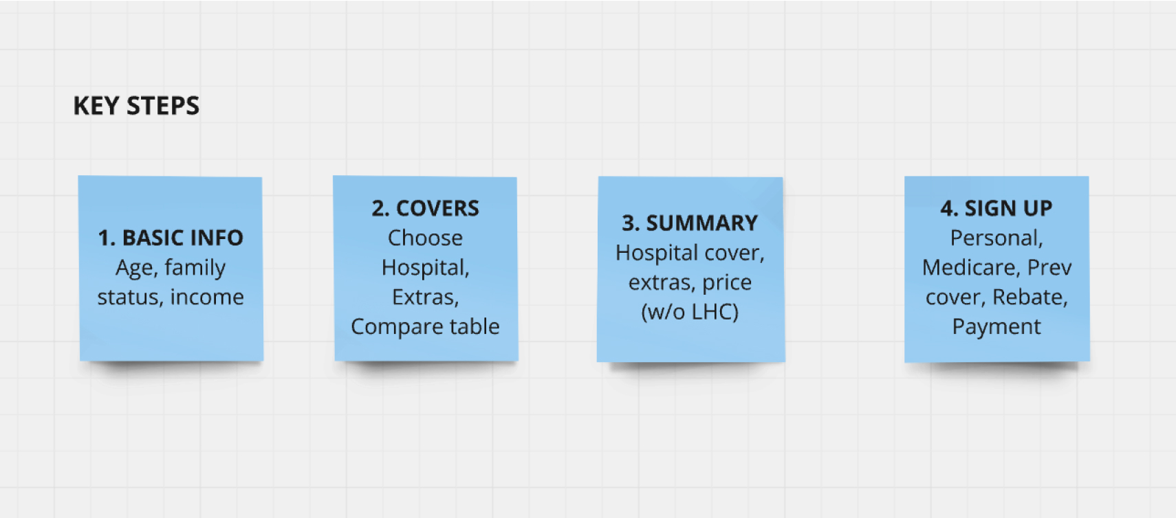
I had to determine the minimum information needed to be collected from customers to provide quotes and facilitate a membership sign up as efficiently as possible.

Flowchart showing steps and interactions for selecting health funds across iSelect, 3rd party websites, LHS website, email/mail, and call center/branch, with color-coded boxes for tasks and communications.
Comparison chart with four personas: Essential Seekers, Protectors, Budget Savvy, and Set & Forget, detailing their insurance needs, expectations, and characteristics with corresponding photos.
Four blue sticky notes listing key steps: 1. Basic info: Age, family status, income; 2. Covers: Choose hospital, extras, compare table; 3. Summary: Hospital cover, extras, price (w/o LHC); 4. Sign up: Personal, Medicare, Prev cover, Rebate, Payment.

Ideate

I sketched early wireframes for each of these stages and began iterating.

The task was to collect minimum information such as age, income, and family status to provide an accurate quote, and then enabling the customer to complete a painless sign up.

The more information collected early on, the easier the sign-up flow. But this approach might lead to early abandonment.

The challenge was in finding a balance.

Handwritten notes on paper showing words like 'COVER', 'INCOME', 'DECLARE', 'Lifestyle entry', and 'Flow with cover selected' in informal script.
Five mobile screens from a healthcare app showing user selection steps including residency, coverage type, about you, date of birth input, and taxable income options.
Screens showing a hospital cover selection interface with options for Bronze hospital plans, pricing, excess amounts, and coverage details.
Four smartphone screens showing steps of enrolling in Latrobe health insurance: entering details, selecting title and name, information on Australian Government Rebate, and payment details with promo code field.

Prototype

I led weekly sessions with the client to bring them along on the design process as it evolved.

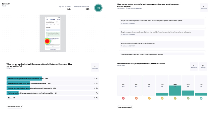
Using a high fidelity prototype on the Maze platform, usability testing was conducted with volunteers from LHS staff.

The test was a success, with a seven of the eight participants completing their task with no difficulties.

A second and more extensive test involving 200 LHS members unfortunately did not materialise, after the client failed to send out the emails in time to meet the tight deadlines.

A complex flowchart or wireframe layout with multiple connected screens and text boxes linked by blue lines, displayed on a grey background.
Three smartphone screens showing a hospital cover selection app: left screen with user info and package options, middle screen comparing coverage benefits, right screen displaying rebate details and income question.
Survey results showing user feedback on health insurance quotes: top priorities are affordable coverage tailored to specific health needs and choice of extras. Satisfaction ratings indicate mixed experiences with 50% meeting expectations. Heatmap highlights user interaction area on insurance quote form.

Refine

The mobile prototype underwent several more rounds of refinement and client review, and desktop screens were designed, all in line with the Latrobe Health style guide.

The design is proceeding to build stage and will see more testing and refinement in the near future.

Latrobe Health Services primary colour palette showing Navy, Light Blue, Grey, and Pink swatches with CMYK, RGB, PMS, and HTML color codes for coated and uncoated printing.

Hospital covers

Latrobe Health Services webpage showing hospital cover plans with pricing and coverage details displayed on desktop, laptop, and mobile screens.

Compare extras

Latrobe Health Services comparison table for Extras Cover displayed on a laptop and mobile screen, showing pricing and coverage options for different plans.

Summary

Latrobe Health Services website displaying Bronze Plus Hospital Cover and Complete Care Extras package details on a laptop and smartphone screens.

Basic info collection

Smartphone screens showing a health insurance app interface with options for age groups, cover types, medical conditions, taxable income, and family status.

Membership form

Mobile prototype

Design system

I customised the MUI design system for use throughout the project.

MUI was recommended by the lead developer on the team, as it has a basis in Material Design and compatibility with existing React components, enabling a relatively easy build process.

Dark mode color palette table showing text and state colors with hex codes and contrast percentages.

Outcome

Outcome

The design is proceeding to build stage and will see more testing and refinement in the near future.