Graincorp

Introduction
GrainCorp is a large Australian agribusiness that specialises in the storage, handling, and marketing of grain and other agricultural products.
A product strategy team and I were tasked with studying the needs of their customers and stakeholders, and then devising improvements to their experience. We interviewed customers, mapped user journeys, and identified problems.
With these insights I designed a new platform to connect these diverse interests in two months.
The new customer portal was presented to the board of directors and met with general approval. The plan is now to develop applications related to key functions of the design.
Team
Role:
UX, UI, Visual design
Team:
1 x Designer, 1 x Product Manager, 2 x Strategy
Time:
8 weeks
Problem
GrainCorp operates a network of storage facilities, export terminals, and processing plants, and is involved in other agricultural, food and logistics sectors.
Across this landscape, third-party contractors and customers were unable to connect or communicate. Their platform for trading grain commodities was also outdated.
An integrated digital solution was required to address customer needs.
Key customers involved in the GrainCorp network were interviewed, in order to understand their roles and how their interactions with the company might be improved.
The customers included growers, commodities buyers, energy suppliers, and transport contractors.


Based on insights gained from the research workshops, and in order to better inform the design process, personas representing the key customers were created.
These personas were used in Customer Journey Maps to help illustrate their respective roles and relationships to GrainCorp.
This process helped the client buy into the vision of the future state customer portal.


With the vision of a future state for GrainCorp now more defined, the design process began with sketching and wireframe development.
The existing GrainCorp platform was deconstructed and reimagined to accommodate new features for energy and transport, as well as the marketplace for grain commodities trading.


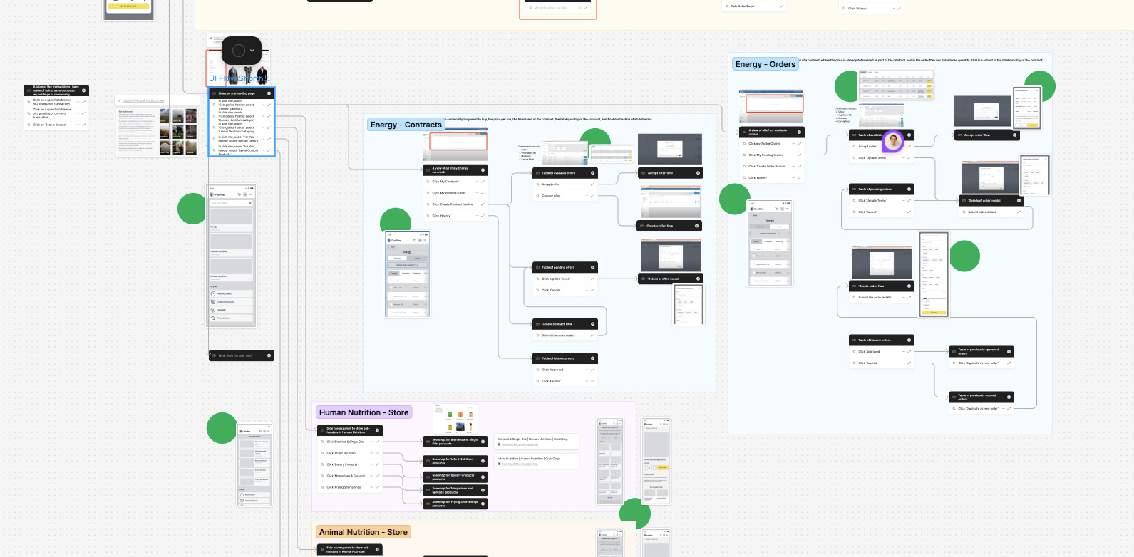
As the information architecture was restructured, the designs were fleshed out, and the navigation between them was defined, a prototype began to take shape.
I presented to the client for their feedback and the design went through several rounds of iterations and improvements.
A key development was adapting the experience for the different use cases.


The design was further polished and applied to desktop format.
The methods by which the new portal addressed the needs of customers was demonstrated to top stakeholders.
These actions including buying and selling commodities, tracking price trends, and arranging deliveries.


For this project I used the GrainCorp style guide to customise a white label Figma system from scratch to suit my needs.
I had a useable system ready in a couple of days, and I continued to update and adjust it as I worked.


Outcome
The future state customer portal was presented to the board of directors and met with general approval.
A plan is now underway to develop applications related to key functions of the design.

