Eurostar

Introduction
In 2022, International high speed rail operator Eurostar was merging with another carrier at the same time as a major rebrand.
Over 8 months, I worked on UX, UI, IA, Interaction and Visual Design briefs, across the ticket booking system, navigation and rebranded page templates.
Result:
Team
Role:
UX, Usability testing, UI, Visual design
Team:
4 Designers
Time:
12 months
passengers transported annually
employees
Rail track, linking European capitals
Challenge I
Eurostar were merging with new partner and needed to design the ticket booking experience to align with both companies.
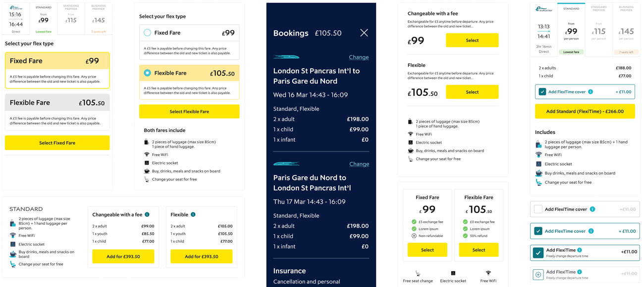
This redesign was an opportunity to address existing issues such as train schedule info, fare types, seat selection and checkout, as well new business demands such as multi buy tickets and additional extras.

Twelve Eurostar customers were interviewed. Common complaints were difficulties when searching for trains, booking tickets, adding extra services to their reservations and managing bookings post-purchase.
These mixed experiences underscored the need to streamline the online platform for easier navigation, efficient booking, and improved post-booking support to better serve customers.


Two personas were created to empathise with a broader range of customers' needs and perspectives, helping us understand behaviours, motivations, pain points, and aspirations.
With these personas as a guide, Customer Journey Maps were developed, detailing the experience of researching travel options, choosing tickets, paying, receiving information and managing the booking.


With a better focus on the problems that needed solving, I turned to sketching as a fast and easy method of thrashing out options for UI, as well as mapping out alternatives for the user flow and other ideas.
User flows were created to get a clear understanding of the steps involved in choosing tickets, choosing extras and then paying. Different flows were needed to understand the differences in booking trains, hotels or a combination.


Much early development work went into exploring different possibilities for the UI, in particular for search result rows and fare types.
A high-fidelity prototype was put together from the new designs and a group of eight subjects were recruited for testing online.
The test results were broadly positive, with subjects all generally able to navigate the process smoothly, from scanning train timetables to selecting a train, understanding fare classes, choosing seats, adding extras, logging in, and making payments.
Minor usability issues such as changing tickets and accessing the cart were identified and addressed. The designs were completed after several rounds of testing.


Challenge II
Eurostar were preparing for a bold new rebrand, featuring a new logo, symbol, colour palette, photography and illustrations.
I was handed the new brand guidelines tasked with interpreting them for the screen.
This would involve balancing the demands of the branding team with practical constraints and customer tastes.

I began with gaining an understanding of the new brand, which was inspired by sparking adventure, travel and excitement.
Research and benchmarking against other travel/luxury brands helped align the new look.

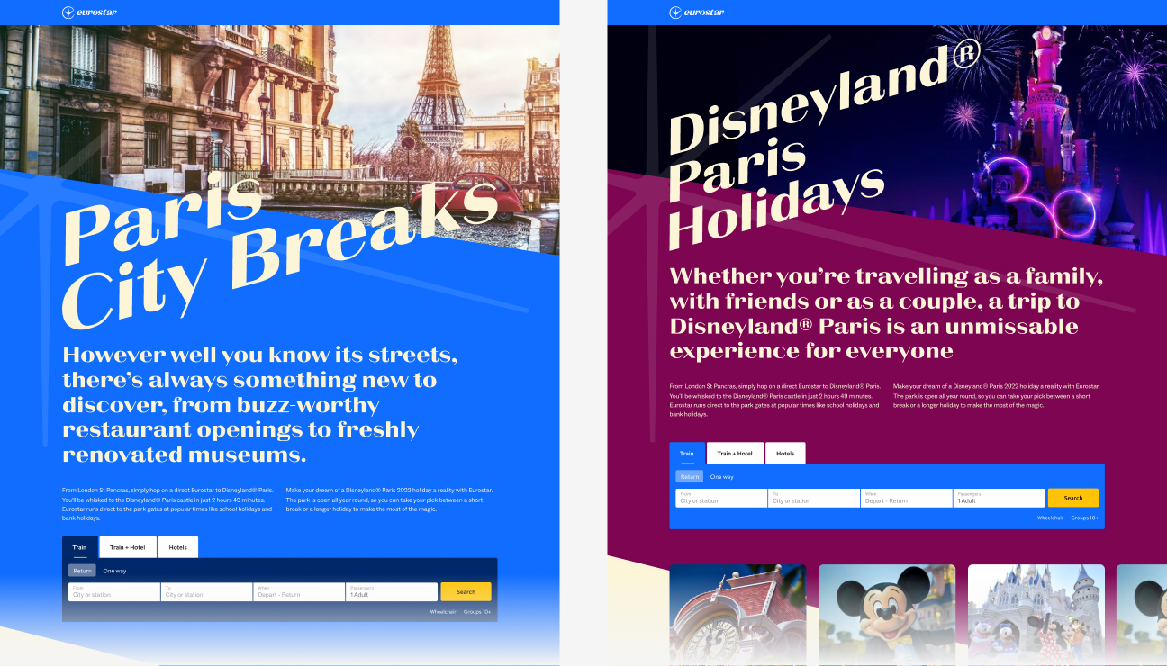
Initial exploration involved pushing the limits of angled typography and colour palette.
The brand team wanted to feature the new logomark, “The Spark” as frequently as possible. This led to experiments with image cropping and sharp angles, in order to maintain the same dynamism.
The Spark didn’t easily lend itself to the spatial restrictions of the screen and needed clever positioning.
The new look evolved over many iterations, discussions with the branding team and senior stakeholders, including the CEO. After a few weeks of iteration and delicate stakeholder management, I finalised designs for key pages that would inform visual design for the rest of the site.

Challenge III
Eurostar had struggled with the placement of separate booking engines for Trains, Train + Hotel, and Hotels.
The tabs for these clashed with three identically named but very different pages in the primary navigation.
The position of the booking engine was especially awkward and made finding images for campaigns an unnecessarily difficult task for editors.

I started with competitive research and analysis understand how we might better integrate booking UI with the navigation.
I wanted the booking functionality to be easily accessed from any page. To avoid clashing with the navigation, I tried positioning the booking engine just above the fold on desktop.
However this soon became problematic when it came to scaling for different screen sizes.


Some probing uncovered that the links in the main nav were largely included for SEO purposes, and so could be safely repositioned to share the same tabs as the booking magnet. This allowed a horizontal layout that could be integrated with the navigation, to allow easy access from any page.

Voilà

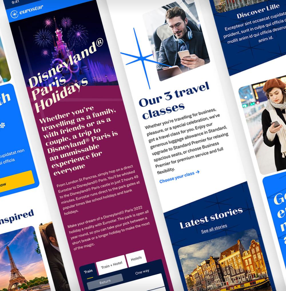
The hero section on the landing page needed to allow flexibility for a variety of marketing promotions and imagery. The headline needed to accommodate long or short messages in all European languages.


One of several templates designed to showcase both the brand and the holiday travel destinations with a sense of excitement.


Content page templates that contained all of the practical information needed by passengers ahead of their journey.


New improved search results page for easy scanning and fare selection.


When designs were signed off by the brand team, components were created for the library. The content editors were to be given a broad colour palette in the CMS. This added to the complexity of the component variants.

The new page template components were part of an overhaul of the Eurostar design system. Over six months, our team constructed a new system, which we documented and handed over to developers as we went along.
I have written a seperate case study about this project:

Results
The new improved end-to-end ticket booking flow design saw:
increase in successful conversions
increase in hotel bookings

